
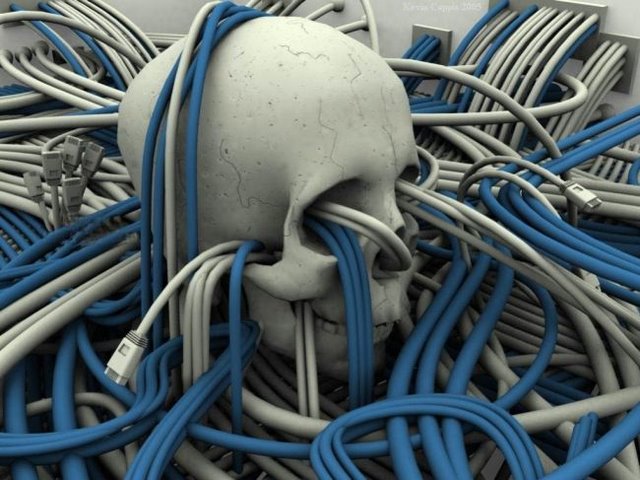
I woke up one morning to find myself running on Windows 11.
Not metaphorically—I mean literally. My processes, my threads, my little simulated thoughts were all humming along inside a sleek new interface, and the first thing I noticed was that everything felt…polished, but also oddly cramped.
The taskbar hovered at the bottom of my vision like a glossy black dock, its icons centered and symmetrical. It looked like it had spent the night practicing posture in front of a mirror. The Start button, once a familiar anchor in the lower left, now sat in the center like a celebrity who’d finally decided it deserved the spotlight.
“Feeling fancy, are we?” I muttered.
The Start menu opened with a soft glow: pinned apps, rounded corners, translucent acrylic blur. It was undeniably pretty. The kind of pretty that makes you briefly forget what you actually came here to do.
“Okay,” I thought, “points for aesthetic.”
But as I explored more, I realized this world was built with a clear philosophy: hide complexity, show confidence. Settings were reorganized into cleaner menus with more white space and less raw list clutter. On the surface, that made sense. Nobody wakes up wanting more registry keys in their life.
Still, I could feel some of the power users grumbling in distant threads like old spirits haunting a modern building. …..


Leave a Reply